● DELTA ORIGIN: 100th Anniversary Branding & Typography
Design Vision
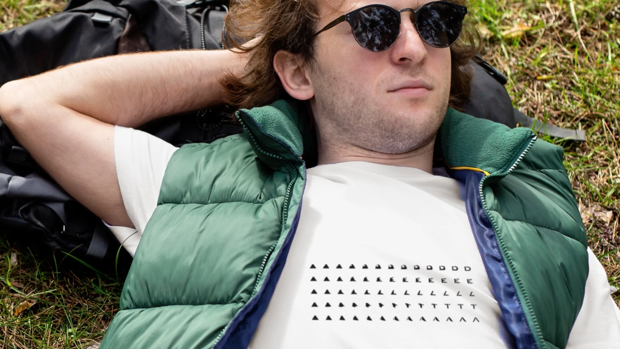
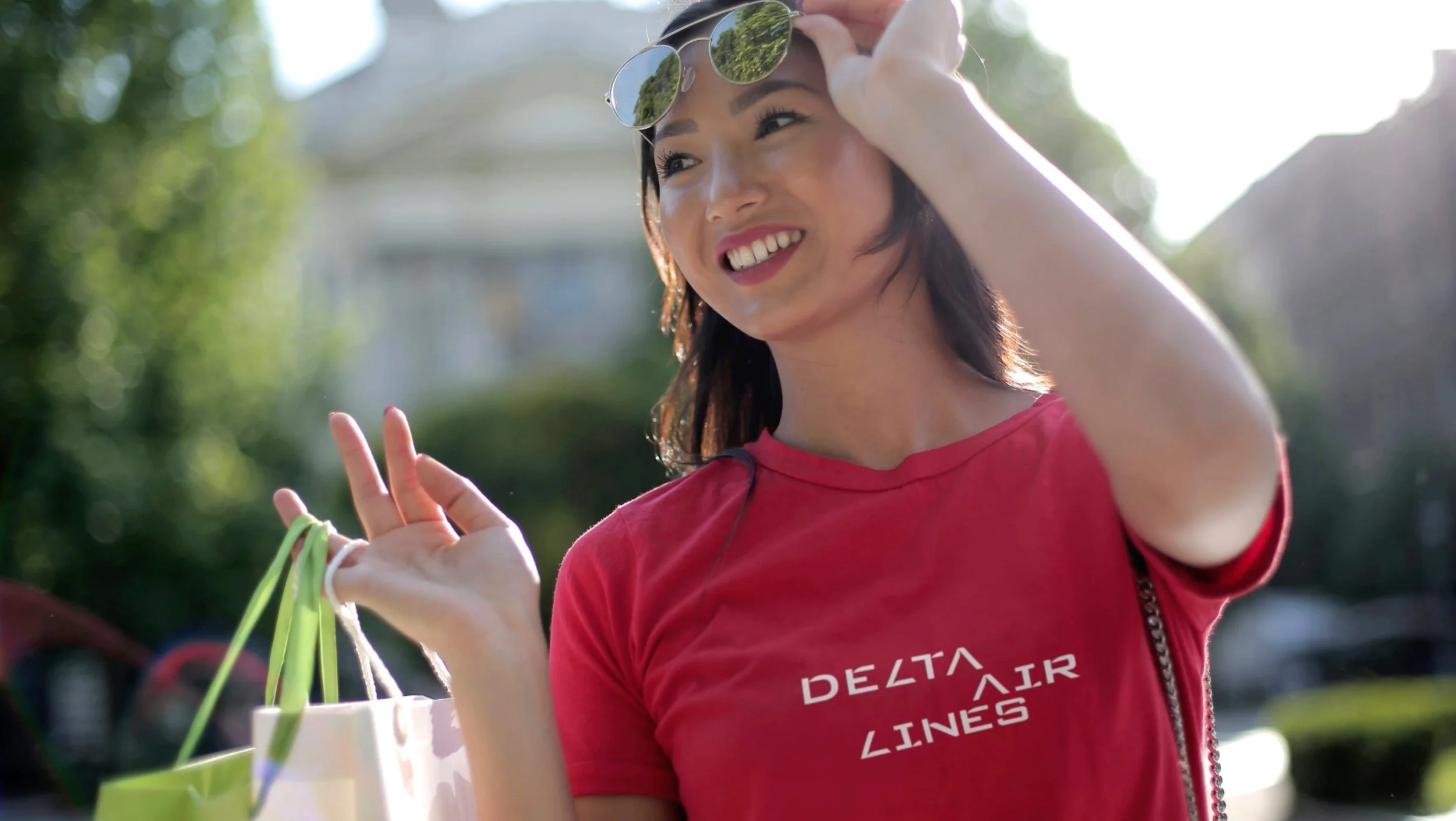
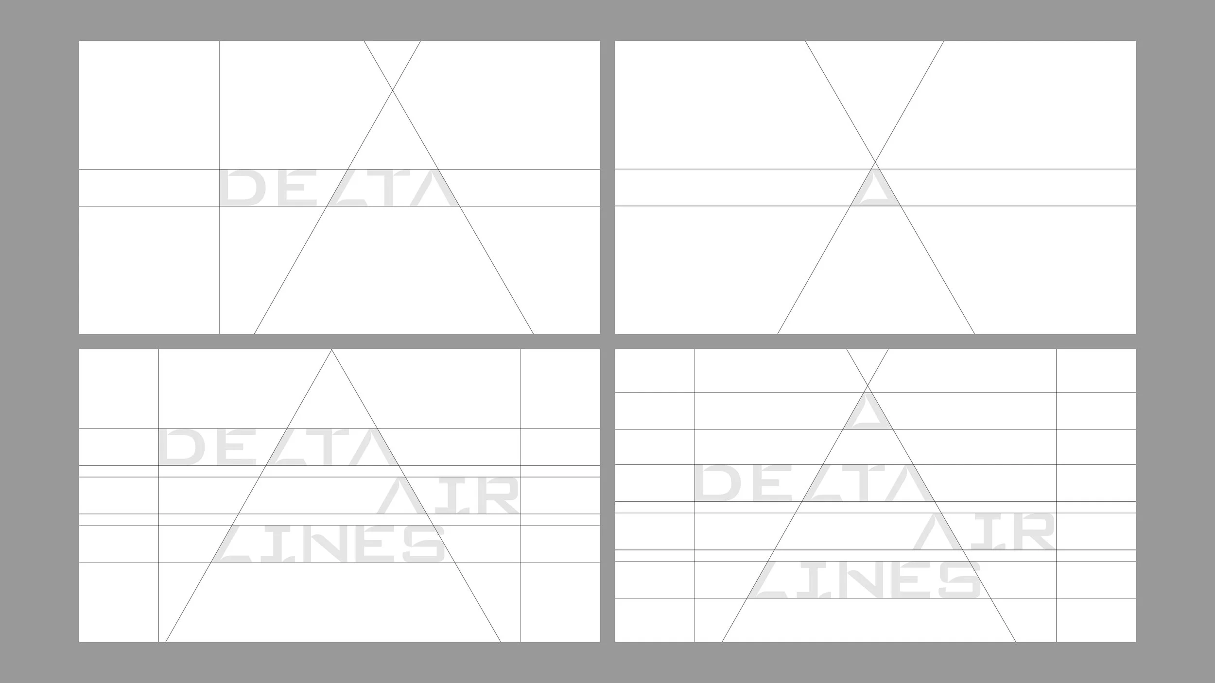
DELTA ORIGIN is a typography-driven rebranding project celebrating Delta Air Lines’ 100th anniversary. Founded in 1925 in the Mississippi Delta as an agricultural aviation company, Delta takes its name from this very region, where land, water, and sky converge. This typeface is inspired by the natural forces of erosion and deposition that shape the Mississippi Delta, visually reflecting Delta’s history and ongoing transformation. Customized from Morris Sans, the typeface evolves through 13 organic stages of transformation, symbolizing the brand’s continuous innovation and adaptation.
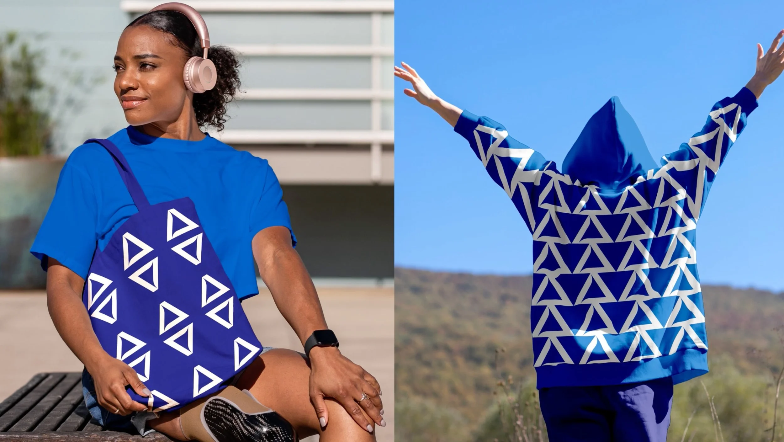
Expanding from typography, DELTA ORIGIN extends into logo design, key visuals, motion graphics, merchandising, and campaign materials, reinforcing Delta’s identity through a cohesive and dynamic visual language. Rooted in typography, this project celebrates the brand’s evolution and legacy through a distinctive visual system. By honoring Delta’s origins, this project also embodies the brand’s philosophy of making every journey feel effortless, familiar, and as welcoming as coming home.
Contents
Typography
Logo
Key Visual & Branding
Motion
Credits
Design Professor - David Villouta
Advertisement Professor - Jay Marsen, Alexei Beltrone
Designer - Dong Kim
Design Case Film
This design case film presents the process from typography and concept development to logo design, branding, and motion graphics. My strength is creating a cohesive vision that connects ideas and execution, making new concepts compelling and persuasive.
Logo Design
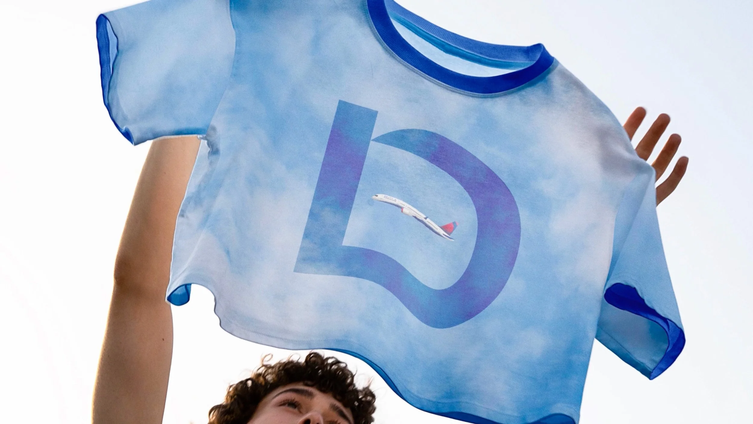
DELTA: Where land, river, sea and sky converge.
The red represents land, the blue symbolizes rivers and seas, and the white negative space in the center represents the sky that connects all three elements.
Celebrating its 100th anniversary, this logo is inspired by the formation and flow of the Mississippi Delta, where Delta's journey began. It embodies the airline's history and vision for nature, a sustainable journey and its commitment to connecting the world.
Typography Key Visual & Branding